Category :
Marketing & Social MediaYouTube Titles and Thumbnails
To learn more techniques and how to create and grow your own travel business, sign-up to become a member today!
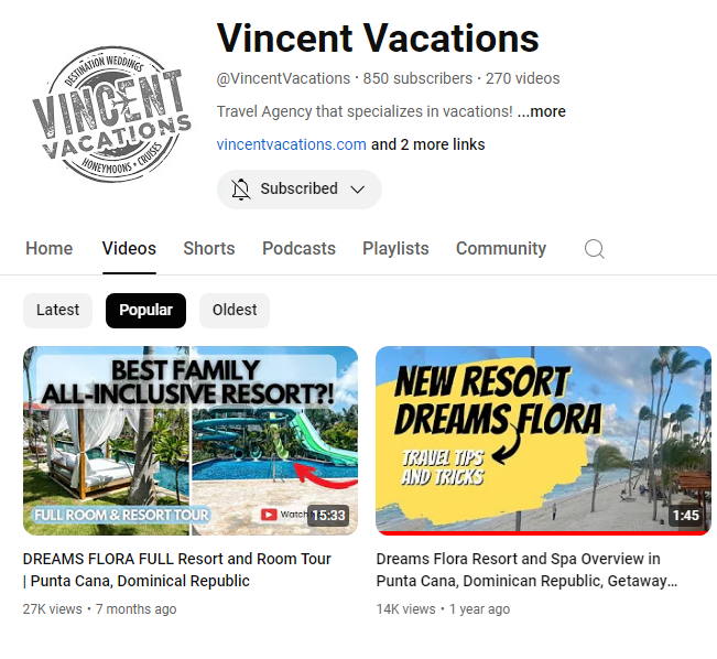
- Crafting compelling YouTube titles and thumbnails is crucial for attracting viewers and boosting engagement.
- Joining Travel Agent Pro provides resources and support to optimize your video content, enhancing your brand and reach.
- Leverage YouTube Analytics, a tool available to Travel Agent Pro members, to refine your strategy and maximize your success.
Titles & thumbnails are the first things your audience sees when deciding what to watch. Here are some things to keep in mind when designing thumbnails, tips for writing titles, and how to use analytics to see how these elements are performing.
The title and thumbnail of your video are the first things your audience sees when deciding what to watch. Think of them as your content's billboard. You want to tell a story, spark curiosity, share a sneak peek and attract more viewers to your videos. We'll cover things to keep in mind when designing thumbnails tips for writing titles and how to use Analytics to see how these elements are performing.
How can your audience tell what your video is about? Usually, viewers will first see your thumbnail and title. This info gives them a glimpse of what your video is about and helps them decide if they want to watch it. Fun fact: 90% of the best-performing videos have custom thumbnails.
Always remember to:
Find Your Style
Use similar styles throughout your content. This helps viewers identify you in a competitive landscape.
Use Familiar Elements
Use familiar colors, faces, and fonts help viewers return to your channel.
Keep it Simple
Bold colors and designs are catchy, but too much is overwhelming.
Target Your Audience
Match designs to your viewer's preferences and familiarity with you.
Stand Out
What can you do to make sure you are unique?
Preview and Spark Curiosity
Your thumbnails should preview your videos and spark curiosity.
Clarity is Key
Make sure they're clear and easy to read.
High Resolution
Thumbnails change sizes on different devices so use high resolution images and text.
Choose You
Thumbnails help viewers choose you and your videos, over everyone else.
Design thumbnails that stand out
Who is your video targeting? Content targeting your subscribers might highlight familiar features, like your best friend. Content targeting casual viewers might focus on actions and emotions that are more universally relatable, like a shocked face.
You can apply the “rule of thirds” to create interesting images. Then, overlay your images with your branding and descriptive text. If you add text, make sure to use a font that's easy to read.
Try not to make the design too complex. Dynamic use of color and composition can help catch the eye, but too much can overwhelm it.
Thumbnails show up differently across devices, so make sure your thumbnail image is as large as possible.
Different audiences have different tastes and thumbnail styles can shift over time. It’s important to keep current on what’s working well in your community. We also recommend experimenting with updating older thumbnails to increase your video’s appeal to new viewers. As a Travel Agent Pro member, you'll have access to resources and training to stay ahead of these trends.
How to write titles
Be accurate. Make sure your title accurately represents the video. If not, viewers may stop watching, which can impact discoverability.
Be succinct. Viewers may only see part of your title. So aim to keep it short and put the most important words near the beginning. Save episode numbers and branding for the end.
Limit ALL CAPS and emoji. Use them carefully, to emphasize emotion or special elements in the video. For example, “Our KIDS Built A ROBOT! ”.
Types of video titles - You can attract your audience with:
Searchable Titles
Clearly outline what to expect so you can easily reach viewers searching for similar content.
Intriguing Titles
Spark curiosity and appeal to viewers who may not be looking for topic-specific content.
Dive into the data
Need inspiration? You can use research insights in YouTube Analytics to explore what your audience and viewers are searching for on YouTube.
You can also get thumbnail and title ideas using the Audience tab in YouTube Analytics to check other videos your audience watched.
Measure the effectiveness of your thumbnails and titles for different audiences using these metrics in your analytics:
For general audiences, look at the click-through rate (CTR) on Home and Suggested in the first 24 hours after publication. Check these numbers on videos that have above-average Impressions (IMP). Home and Suggested are where viewers often discover new videos and channels.
For subscribers, look at the click-through rate (CTR) in the Subscriptions Feed in the first 24 hours after publication. Although your subscribers may come to your videos from elsewhere on the platform, the Subs feed represents your most engaged fans.
We recommend reviewing your thumbnails to see if they bring out the best of the video. Also, make sure to follow our thumbnail policy.
Taking pictures during your shoot so you have several options for thumbnails when you upload your video.
Thinking about who may watch your video and where they may find it to choose between a searchable or intriguing title.
After posting your video, don’t forget to look at your metrics in YouTube Analytics to understand the impact of your thumbnails and titles. Travel Agent Pro provides guidance on interpreting these analytics to optimize your content.
Thumbnails: Before You Design, Let's dive in.
Before you design, consider who your target audience is.
If you're catering to your subscribers, you may want to feature familiar elements like a picture of you or your pets.
Or if you want to appeal to a broader audience you could use universally recognizable elements and ask yourself, what value is your video offering the viewer? And how can a thumbnail help communicate that and encourage viewers to watch? Be accurate. It's also very important that thumbnails accurately reflect your content which can lead to better watch time. On the flip side a misleading thumbnail can lead to decreased watch time as viewers might click off as soon as they realize it didn't accurately represent the content itself. Go for the emotional impact. Think about how you can express a story or an emotion in your thumbnail. For example, include a moment of peak discovery, conflict, or excitement to hook your viewers. Take pictures during your shoot of faces or relevant props so you have several options to include when creating your thumbnail. And finally familiarize yourself with our thumbnails policy in the Help Center to make sure yours doesn't violate our Community Guidelines.
Design Tips
Now that you're done planning Thumbnails: Design Tips here are some design tips to help you bring your idea to life. Make the design pop, even on small screens. A lot of viewers are on mobile devices so make sure the thumbnail still looks good and readable shrunk down. We recommend 1280 x 720 pixels which is a 16:9 ratio and saving it as a JPG, GIF, BPM, or PNG. Use the rule of thirds. The rule of thirds is a guideline used in visual design. It states that if you divide your image into thirds both horizontally and vertically the main subject or element should be where these lines intersect. This helps create interest in the composition of your thumbnail. And don't make the design too busy. Dynamic use of color and composition can help catch the eye but too much can be overwhelming. Strike a balance when using lots of color of elements. And remember, tastes change over time. Don't be afraid to experiment with new thumbnail designs and even update old ones that haven't performed well to increase your video's appeal to new viewers. Next up, let's talk about titles.
Titles: Types & Tips Just like with your thumbnail your title can help a viewer decide if they want to watch your video.
You can think of titles in two categories: searchable and intriguing. Searchable titles are more straightforward like "How to tie a tie." These cater towards viewers' pre-existing interests and appeal to those who are searching for specific topics. On the other hand intriguing titles focus less on searchable keywords but instead create a strong curiosity in the viewer. And they often have a more creative relationship with their accompanying thumbnails. An example of an intriguing title could be something like "This is NOT yellow." These types of titles often appeal to viewers who may not be looking for topic-specific content. But both types of titles can be successful with viewers. It's up to you to decide which works best for the content you're creating. No matter which you choose keep these three tips in mind as you're writing. Number one, be accurate. Your title should represent your video accurately or else viewers may stop watching, which can affect your discoverability. Number two, keep it short. Viewers may only see part of your title so put the most important words at the beginning. Save things like branding and episode numbers for the end. And number three, limit the use of all caps and emojis. These can be really great elements but use them sparingly to highlight important parts of your title. OK, now that you know the general best practices for thumbnails and titles
Using Analytics to Track Performance & Find Inspiration
Let's walk through how you can use Analytics to see how yours are performing and to find inspiration. When evaluating the effectiveness of your titles and thumbnails click-through rate and watch time in the first 24 hours after uploading can help give you an indication of how a video's doing. Click-through rate represents how often viewers watch a video after seeing a thumbnail. And watch time can tell you how long they stuck around. To check engagement with your subscribers it helps to look at click-through rate in the Subscriptions feed. For general audiences it can be helpful to look at the click-through rate on Home, Suggested, and Search since this is where viewers often discover new videos and channels. Also, keep in mind that, as reach increases it's possible that click-through rate will decrease since a more casual audience is potentially less likely to click on your video relative to your core fanbase. What's most important, though is to look at the overall performance of your video. So, not just click-through rate but also things like audience retention and overall watch time.
If you have a high click-through rate but low watch time and retention it can mean your titles and thumbnails initially attract viewers but that attraction isn't kept up with the actual video content. Or it can mean viewers felt like your title and thumbnail weren't accurate. It's important to not only attract viewers but also make sure they stick around to watch your content. And finally, if you're looking for inspiration check out the Audience tab in Studio Analytics. Here, you can find other videos your audience watched to spark ideas for your thumbnails and titles. And use the Research tab to explore what your audience and viewers are searching on YouTube. We hope these tips will help you create strong thumbnails and titles for your content.
Be sure to check out the links in the description for more info.
Ready to take your travel content to the next level? Join Travel Agent Pro and gain access to exclusive resources, training, and support to optimize your YouTube strategy and grow your audience. Learn More
Learn more about this by signing up as a member, today! Travel Agent Pro Application Form.
To learn more techniques and how to grow your travel business, read more on our Pathfinder Series.


